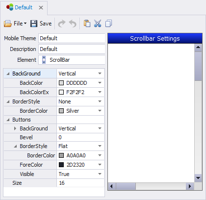
Themes: Scrollbar

In the design view, the Scrollbar property is available to graphical controls where content can be expanded horizontally or vertically.
In Mobile Themes > ScrollBar, you can set the BackGround style/color, BorderColor, Button style, Size, and Style.
For example this property is available in the ComboBox, DataGrid, Desktop Icons, Image List, ListBox, MenuList, Panel, and PanelList.
The properties for Scrollbars at the Application design level are:
(Default) - The scrollbar's appearance such as background coloring and line thickness is set by the properties under Mobile Themes > Scrollbars. The type (Horizontal or Vertical, automatic, both or neither) is obtained from the control under Mobile Themes > [control name] > Scrollbars.
Automatic - A vertical and/or horizontal scrollbar will display once the control exceeds the limits of the screen size.
None - Scrollbar display is disabled.
Horizontal - The horizontal scrollbar is enabled.
Vertical - The horizontal Vertical is enabled.
Both - The horizontal and vertical scrollbars are enabled.
For property descriptions, see Graphical Control Properties.